

Overview
Analytics is your bird’s-eye view of how the bakery is actually doing. It pulls your real numbers — revenue, orders, margins, and best sellers — into one dashboard so you can spot trends, see what’s selling, and make decisions with data instead of a gut feeling. Find it under Analytics in the sidebar (/analytics). It’s part of the Growth plan.
Good to know: Revenue reflects money actually recorded as paid — not the total you’ve invoiced. A big invoice you sent but haven’t collected won’t show up here until the payment is recorded.
The Four Stat Cards
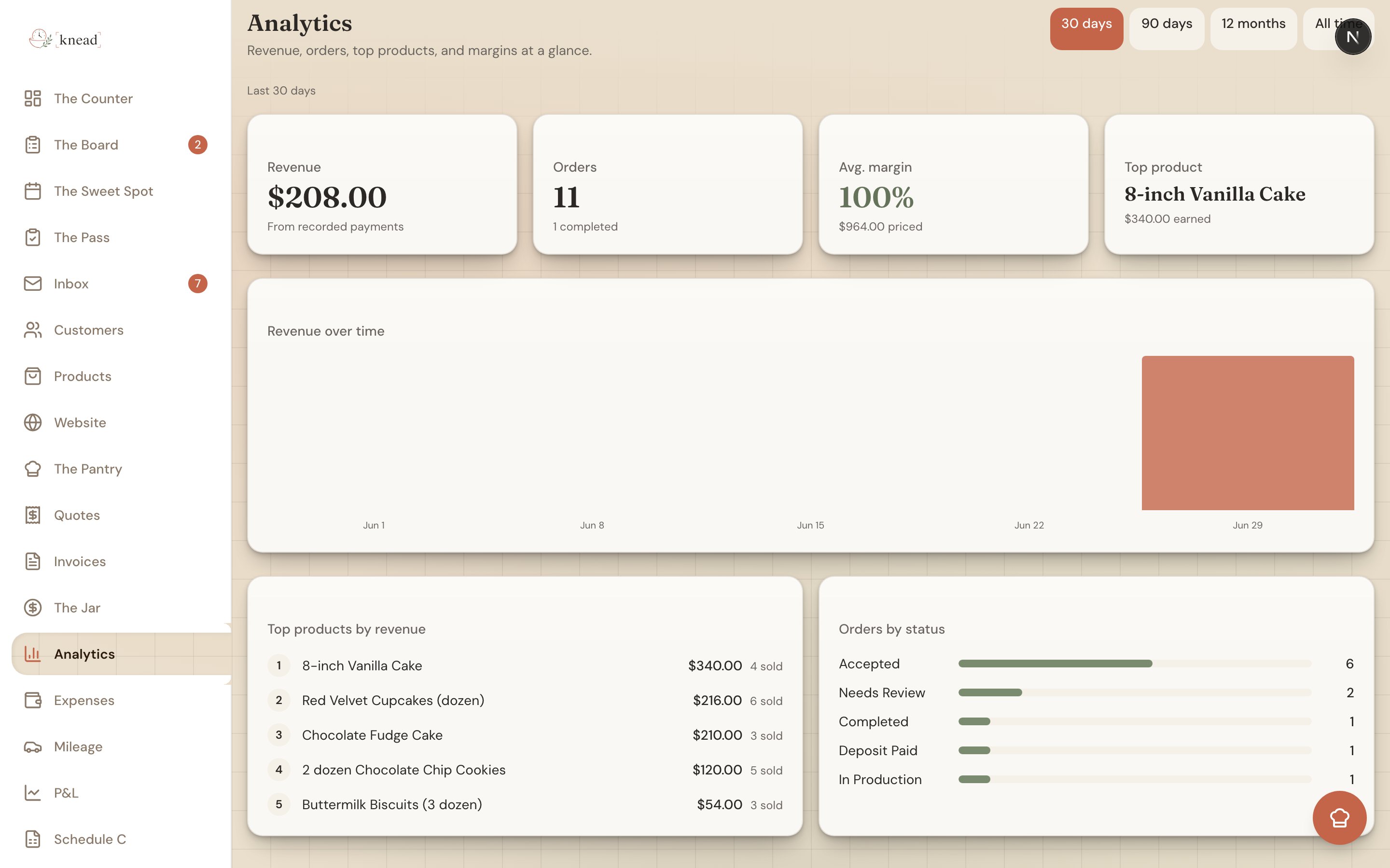
Across the top you’ll see four numbers that summarize the period you’re viewing:- Revenue — Total income from payments you’ve recorded in this period.
- Orders — How many orders you took, plus how many of them are completed.
- Avg. margin — Your average profit margin across products, color-coded so you can read it at a glance:
- Green — 50% or higher. Healthy.
- Brass — 25% to 50%. Room to improve.
- Terracotta — under 25%. Worth a second look at your pricing.
- It shows a dash (—) until your products have ingredient costs to calculate against.
- Top product — Your single best seller by revenue for the period.
Revenue Over Time
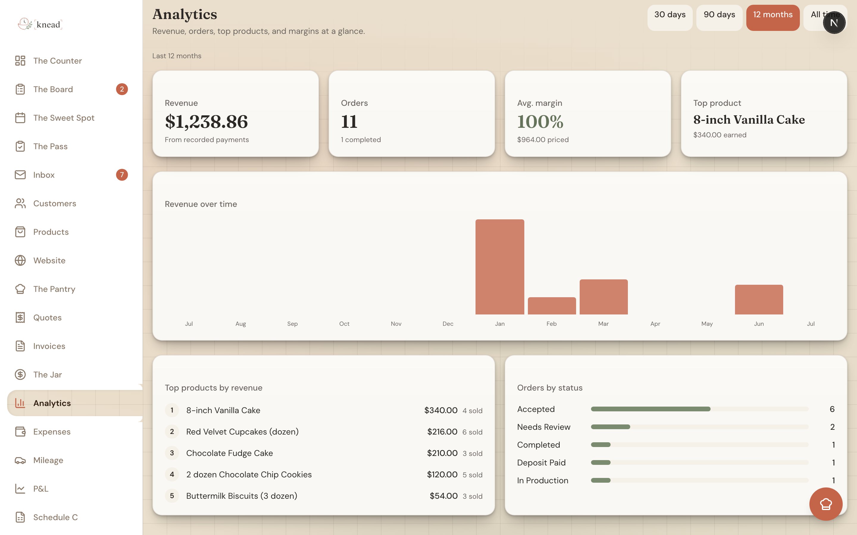
Below the stat cards is a revenue-over-time bar chart that shows how your income rises and falls across the period. The bars adjust to the range you pick:- Last 30 days and 90 days show weekly bars.
- 12 months and All time show monthly bars.
Top 5 Products & Order Status
Under the chart, two more panels round out the picture:- Top 5 products by revenue — A ranked list of what’s earning you the most. Use it to decide what to feature, what to raise prices on, and what might not be worth the oven space.
- Order-status breakdown — How your orders in this period split across their statuses, so you can see how much is still in flight versus completed.
Choosing a Time Period
A period selector at the top controls everything on the page at once — the stat cards, the chart, and the lists all update together. Choose from:- Last 30 days
- Last 90 days
- 12 months
- All time
Good to know: Because Analytics is built on recorded payments, keep your invoices and manual payments up to date. The more accurately you log what you’re paid, the more accurate every number here becomes.
Related Articles
- Understanding The Counter
- What The Counter Watches For
- Setting Prices and Understanding Margins
- Recipe Costing with The Pantry
- Profit and Loss Report
Still need help? Contact us